
Design engagement · Website UX/UI
NextBurb
A website for a US neighbourhood-discovery platform: a new concept explained simply, with a guided path from “where should we live?” to a shortlist of places.
- Client
- NextBurb
- Sector
- Neighbourhood search (PropTech)
- Market
- US
- Work
- Website UX/UI redesign
01The brief
Nextburb is a platform that helps people discover their perfect neighborhood when relocating. They needed a user-friendly website that guides users through the process of finding the ideal place to live based on their preferences and lifestyle. It was a genuinely novel concept that required clear explanation.
02Discovery
We conducted user research and analysed competitor websites to identify pain points and opportunities for differentiation. Key findings included the need for a simple, step-by-step process and clear communication of Nextburb's unique data-driven approach to neighbourhood matching.
03Goals
- Create a clear, concise homepage that immediately conveys Nextburb's value proposition
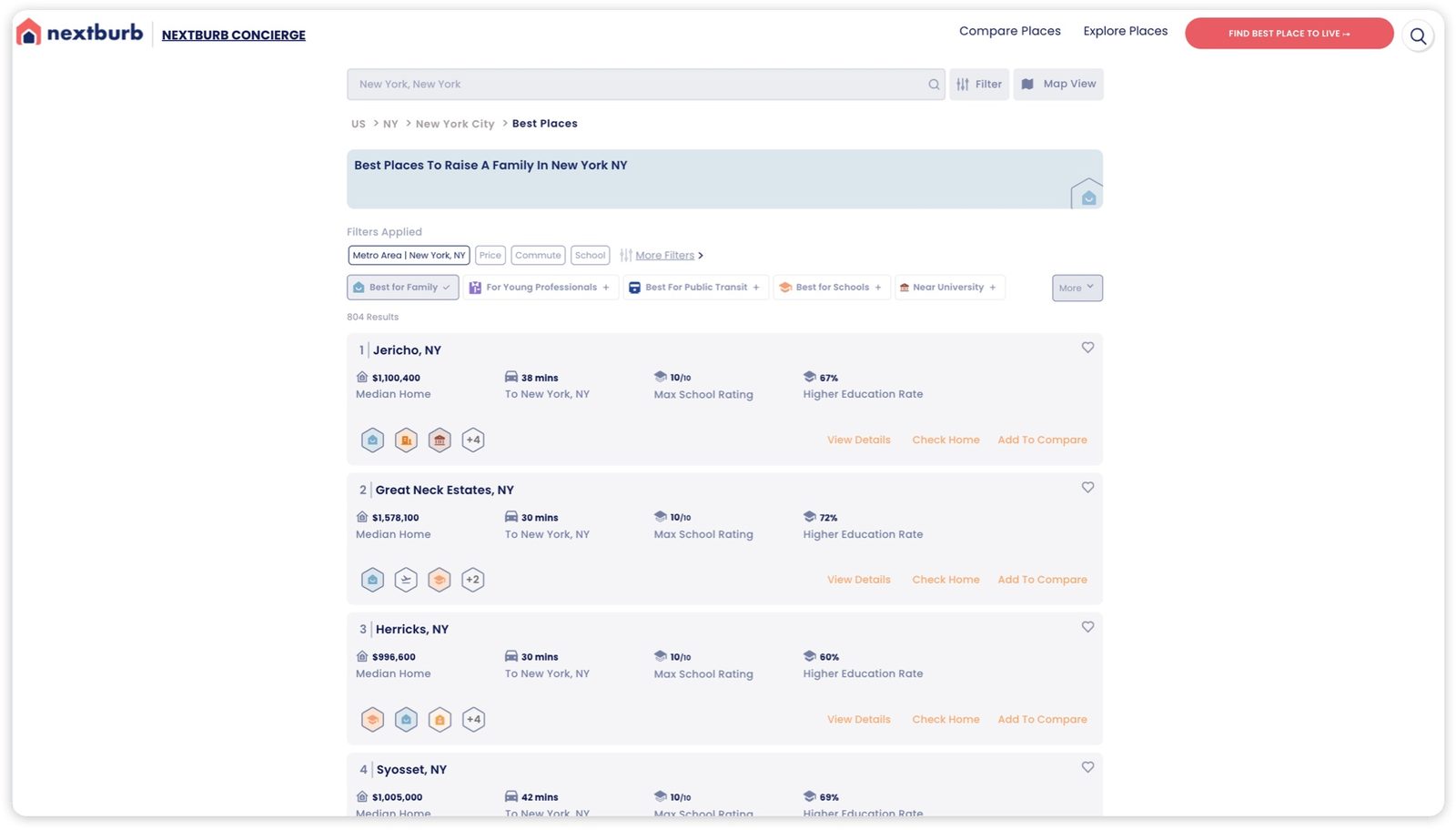
- Design an intuitive user flow that guides users through the neighbourhood discovery process
- Incorporate data visualisations to showcase Nextburb's data-driven insights
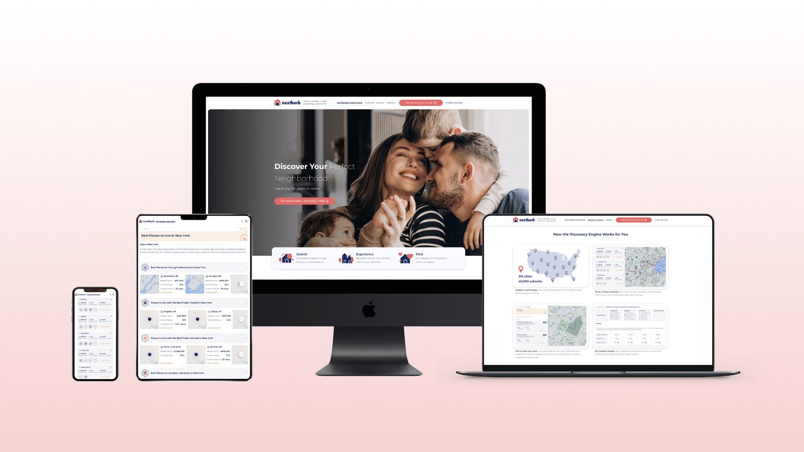
- Ensure a fully responsive design that works seamlessly across all devices
04Design decisions
- A prominent hero section with a clear call-to-action to start the neighbourhood discovery process
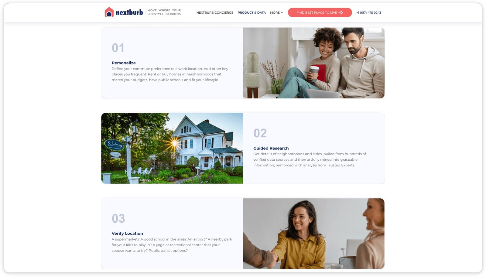
- A step-by-step guide using icons and brief descriptions to make the service immediately legible
- Testimonials and success stories to build trust and credibility with new users
- Data visualisations (maps and charts) to highlight Nextburb's data-driven approach
05Type and colour
Primary: Montserrat: modern, professional, and highly readable across screen sizes.
Secondary: Lato, a complementary sans-serif for body text and supporting elements.
- Bay Blue #2563EB
- Home Pink #EC4899
- Light #F8FAFC
06Problems and solutions
What was in the way
- Novel concept: As a new startup, Nextburb needed to quickly communicate a value proposition that most users had never encountered before
- Process clarity: Users needed to understand how the neighbourhood discovery process works, intuitively and without documentation
- Trust deficit: Being new to market, Nextburb needed to establish credibility before users would commit personal preference data
- Cross-device accessibility: A diverse user base demanded a consistent, high-quality experience across all screen sizes
What we changed
- Clear value proposition: Designed a concise homepage with a prominent hero that immediately communicates Nextburb's mission and benefits
- Step-by-step onboarding: An intuitive visual guide on the homepage walks users through the process before they commit
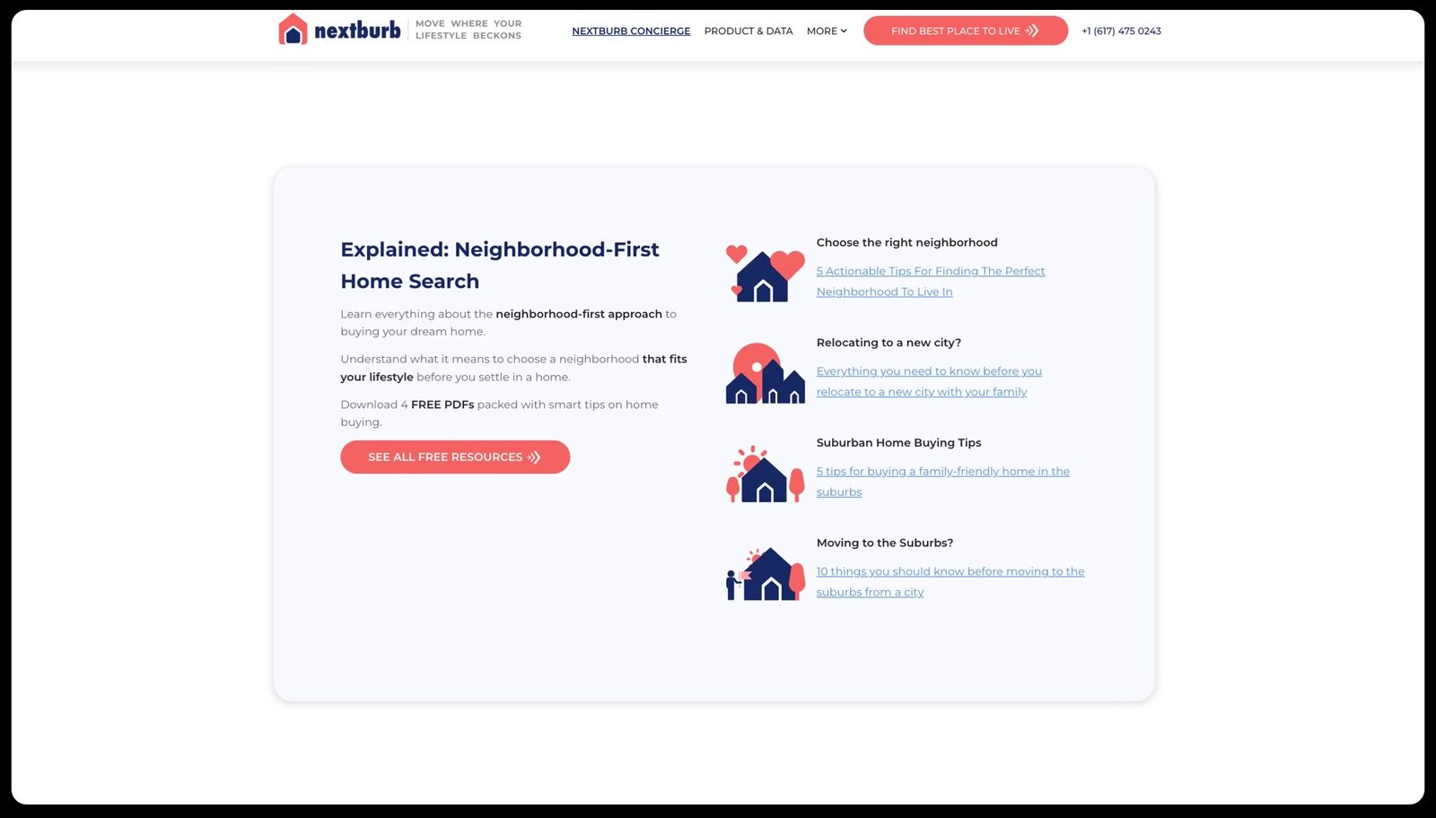
- Social proof integration: Testimonials, success stories, and data visualisations establish trust and credibility
- Responsive design: Seamlessly adapts to different screen sizes, ensuring a consistent experience across all devices
07From the work
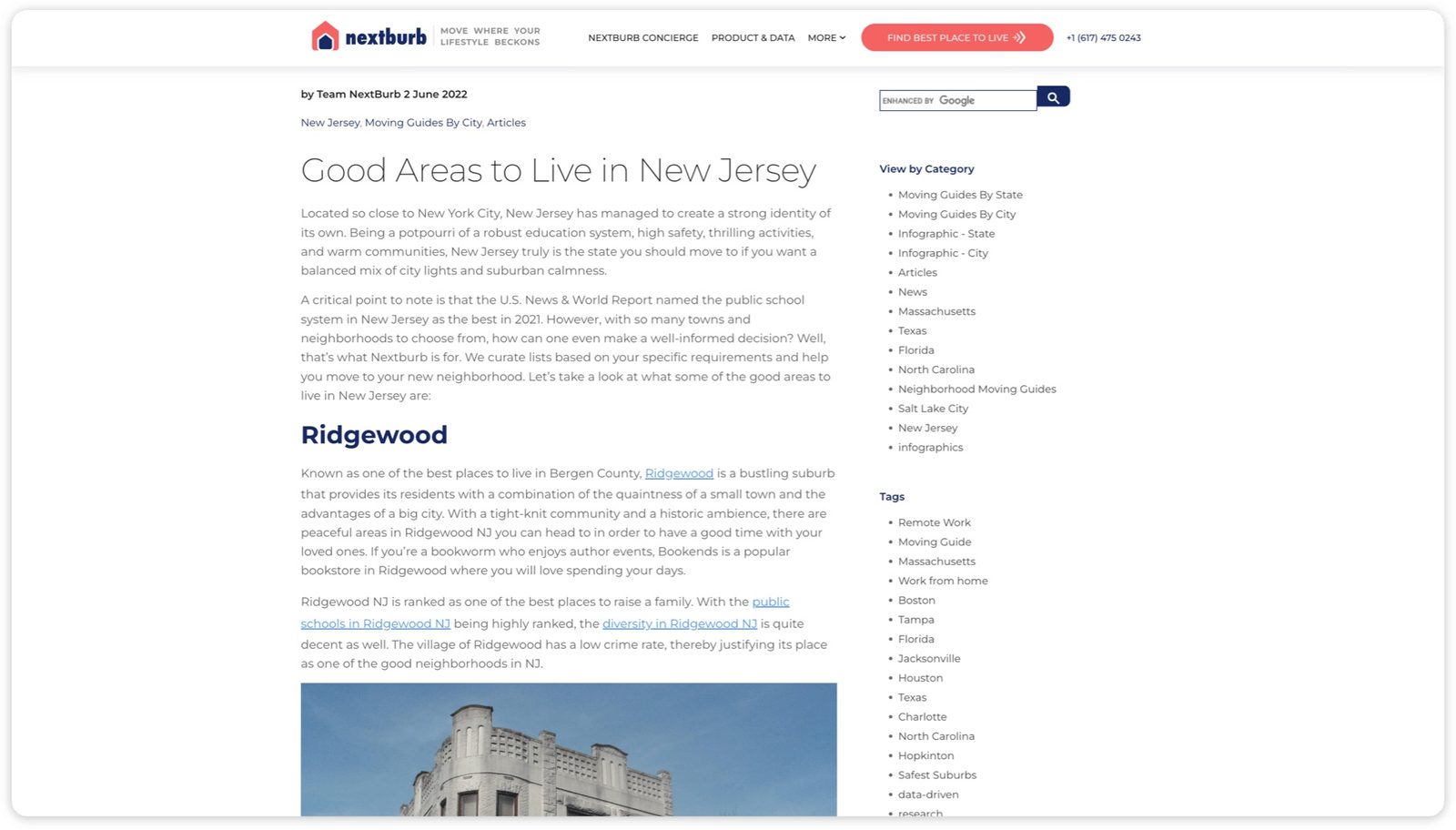
08Takeaways
- A clear, concise value proposition is essential for engaging users with a novel product concept
- Guiding users through a step-by-step process can significantly improve conversion rates
- Data visualisations and social proof are powerful tools for building trust and credibility with new audiences
About outcomes This page shows the work, not results. Outcome figures from this engagement are not published here because we hold no dated source for them; our client case studies show measured outcomes with their limits.