
Design engagement · Website UX/UI
BayTech 360
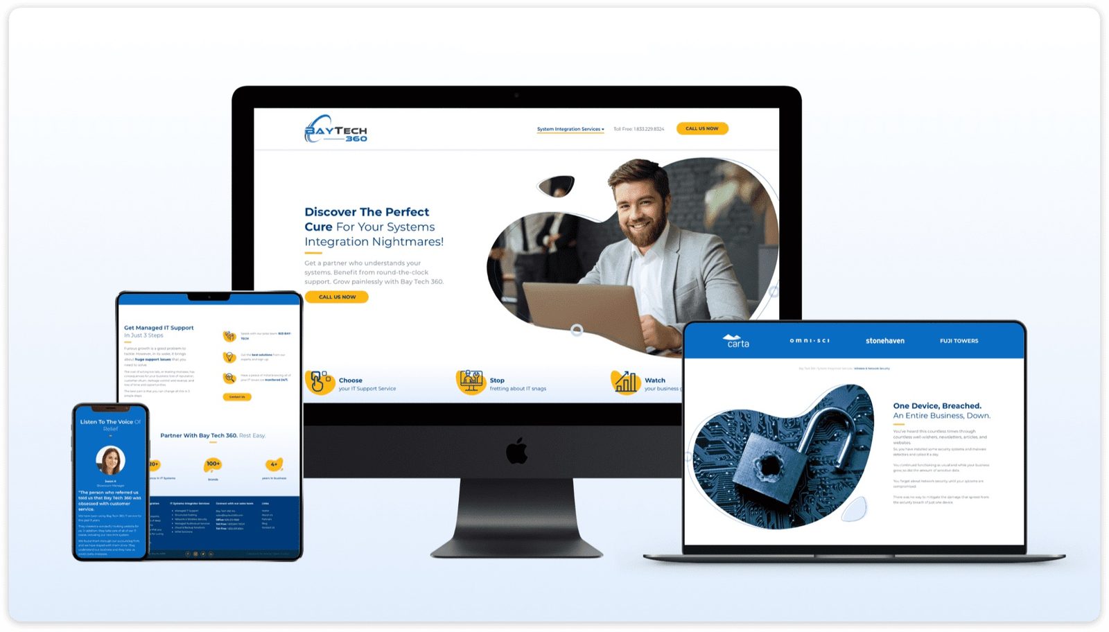
A website redesign for a US technology solutions provider, built for CTOs and IT managers: expanded services made easy to scan and the technical expertise made visible.
- Client
- BayTech 360
- Sector
- Technology solutions
- Market
- US
- Work
- Website UX/UI redesign
01The brief
BayTech 360 approached us for a website redesign to better reflect their expanded services, elevate their brand, and improve lead generation. Goals: increase time on site, boost contact form submissions, and improve perception of the company's technical expertise.
02Discovery
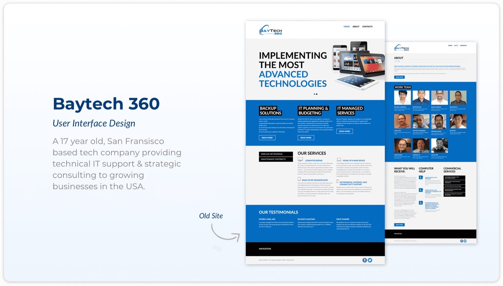
Old site audit revealed dense text blocks, outdated visuals, and unclear service navigation. Competitor research showed that top-performing tech sites focused on solutions and outcomes rather than specs. BayTech 360's diverse service offering needed messaging that balanced technical depth without overwhelming non-expert visitors.
03Goals
Target Audience: CTOs and IT managers seeking strategic partners, not just vendors. Secondary: potential new hires evaluating company culture.
Design Objectives: Clean, modern layout that feels trustworthy. Highlight outcomes and ROI, not just technical specifications.
04Design decisions
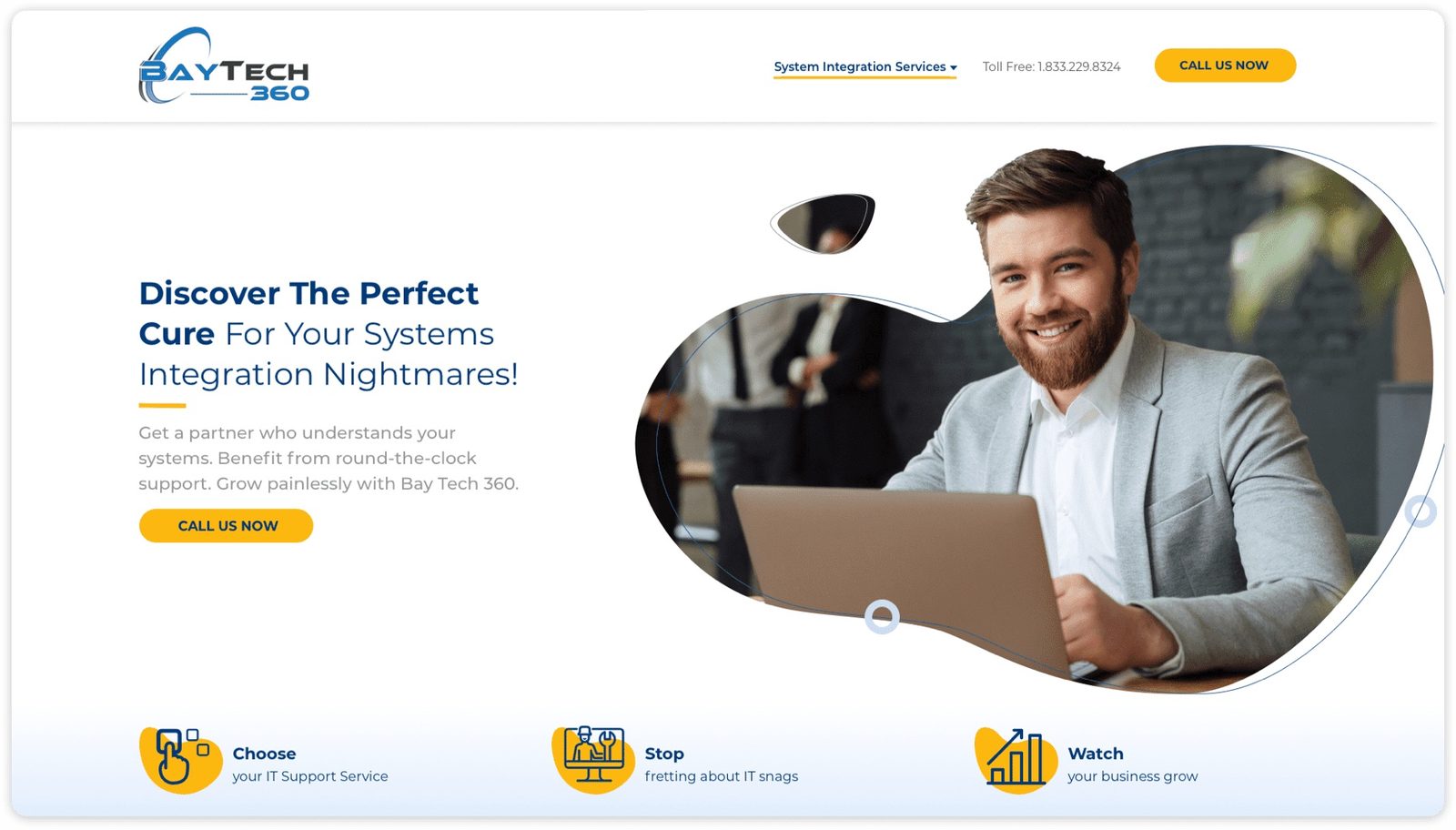
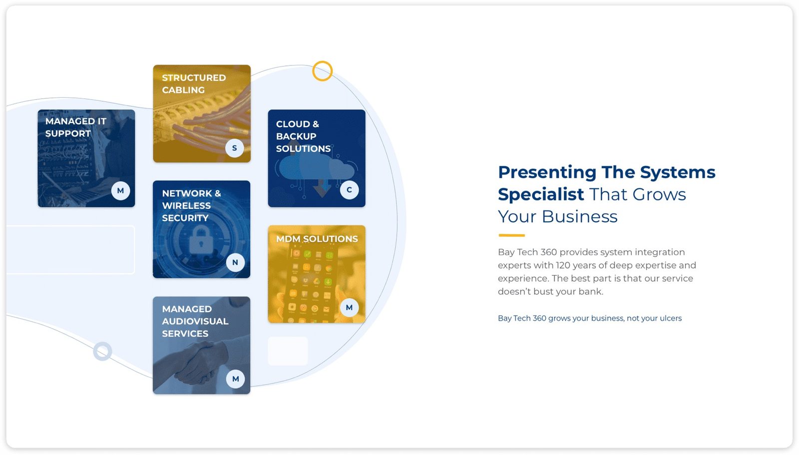
- Structure: Solutions-focused homepage with clear service breakdowns by industry vertical
- Visuals: Moved away from generic stock photos toward custom graphics and subtle tech-inspired patterns
- Case Studies: Reframed around ROI and problem-solving outcomes, not just the technology stack used
05Type and colour
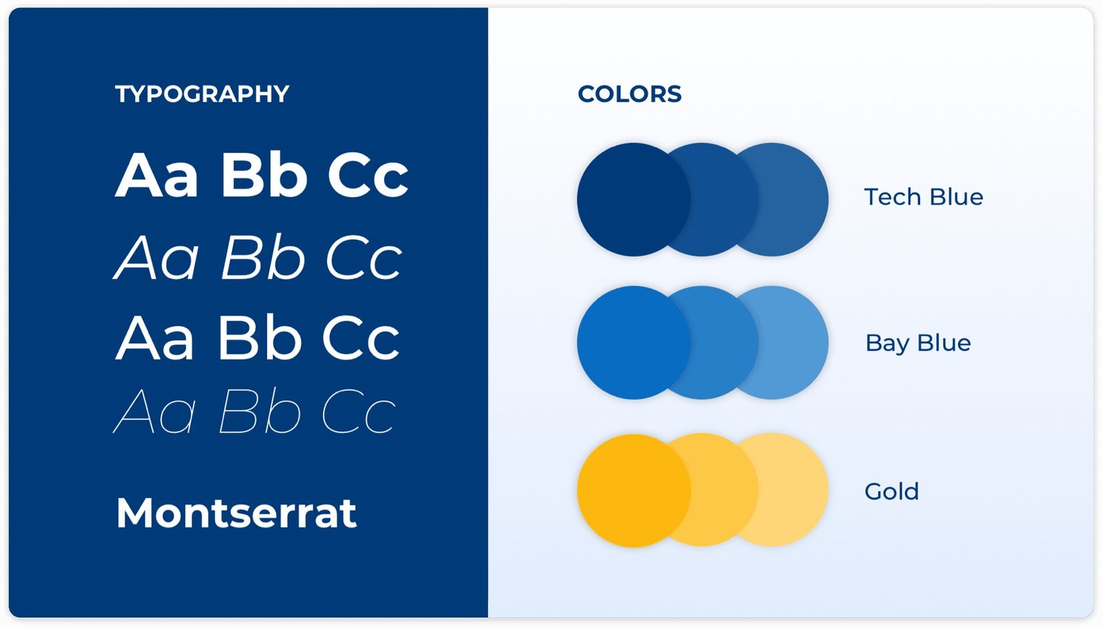
Primary: Clean sans-serif for maximum readability across devices and screen densities.
Secondary: Same typeface at a heavier weight for personality in headers, keeping coherence without introducing visual noise.
- Tech Blue #1E3A5F
- Bay Blue #2563EB
- Gold #F59E0B
06Problems and solutions
What was in the way
- Confusing terminology: Industry jargon and overly technical language alienated non-expert visitors and decision-makers without deep IT backgrounds
- Lack of social proof: Limited testimonials and case studies made potential clients hesitant to trust BayTech 360's capabilities
- Unclear pricing: Highly customised service pricing led to abandoned enquiries. Visitors couldn't self-qualify before reaching out
What we changed
- Plain language revisions: Rewrote all copy to focus on business benefits and outcomes, not technical features
- Success Stories section: Brief case studies highlighting how BayTech 360 helped similar businesses overcome real challenges
- Transparent pricing models: Tiered service packages with clear inclusions to help prospects self-qualify and reduce friction before contact
07From the work

08Takeaways
- Website redesign is an iterative process, not a one-time fix. Build in feedback loops from the start
- Balancing client desires with actual user needs is a constant, productive negotiation
- Usability improvements don't require a total overhaul. Targeted, evidence-based changes consistently outperform big-bang redesigns
About outcomes This page shows the work, not results. Outcome figures from this engagement are not published here because we hold no dated source for them; our client case studies show measured outcomes with their limits.