
Design engagement · Website UX/UI
Muditha Zero Waste: Website
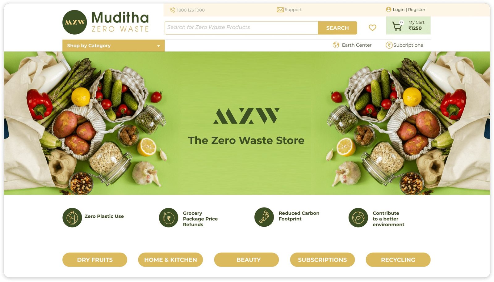
A full e-commerce redesign for a zero-waste online supermarket in India: easier product discovery, a simpler checkout and content that teaches shoppers why zero waste matters.
- Client
- Muditha Zero Waste
- Sector
- Zero-waste online grocery
- Market
- India (Hyderabad)
- Work
- E-commerce UX/UI
01The brief
Muditha Zero Waste needed a full website redesign to improve user experience and business performance. Primary goals: increase average session duration, reduce cart abandonment, and grow the customer base through a more intuitive, educational digital experience.
02Discovery
User testing sessions revealed significant friction in the checkout flow and product discovery. Competitors were either too text-heavy or lacked practical guidance on zero-waste living. Users wanted education built into the shopping journey, not as a separate blog.
03Goals
Target Users: Eco-curious newcomers and committed zero-wasters: two distinct segments requiring different levels of guidance.
UX Objectives: Reduce friction in the purchase path; educate without overwhelming; make zero-waste feel achievable, not aspirational.
04Design decisions
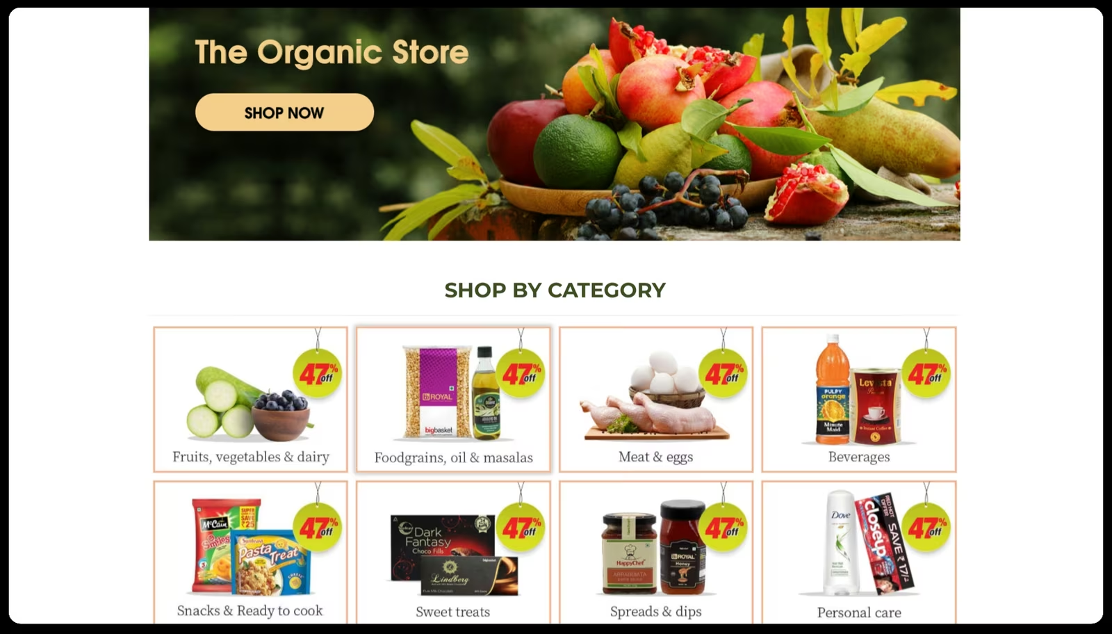
- Clear navigation with smart filtering by lifestyle, room, and impact level
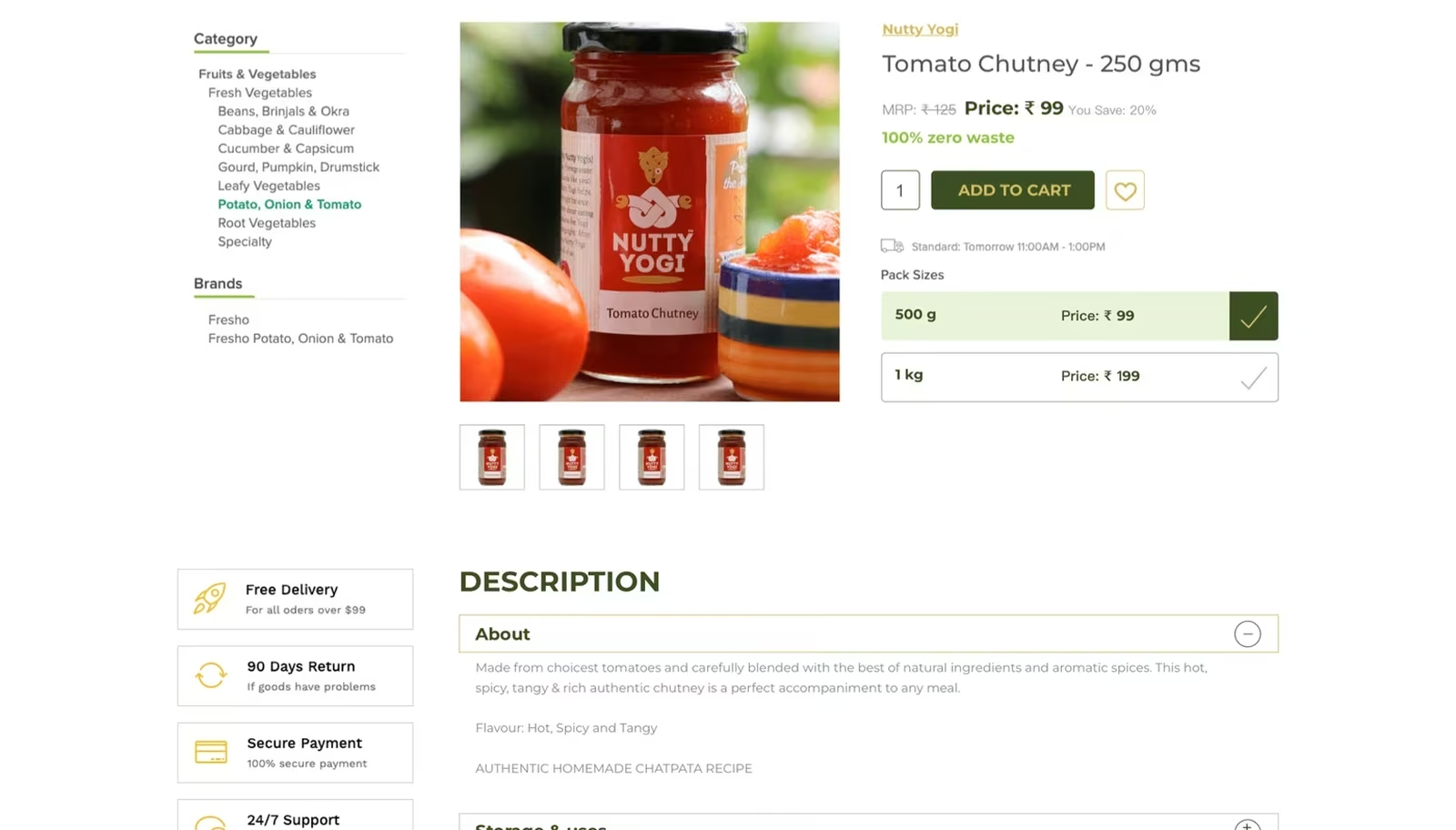
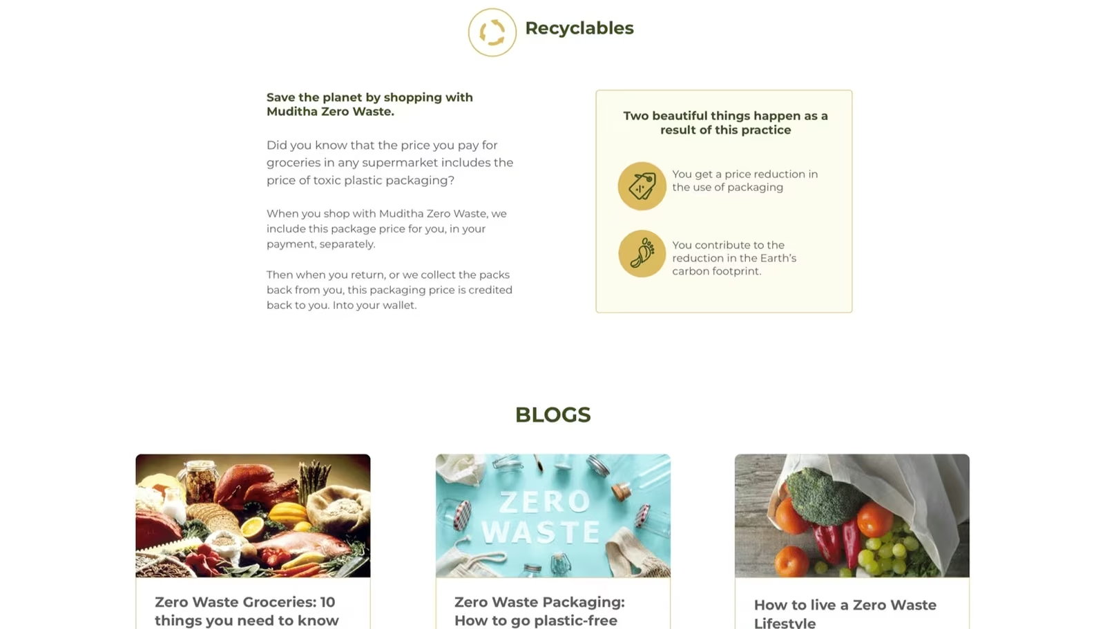
- Product pages integrating benefits, How to Use, and refill instructions in one flow
- Visual progress indicators showing environmental impact of each purchase
- Success Stories section integrating user-generated content throughout the experience
05Type and colour
Primary: ITC Avant Garde: geometric and distinctive for headlines.
Secondary: Gothic Std Demi (bolder weight), used for subheadings to create clear visual hierarchy without introducing a third typeface.
- Thrive Green #4A7C59
- Harvest Gold #C8A951
- Super Cream #F5F0E8
06Problems and solutions
What was in the way
- Photography constraints: Product photography was difficult at an early stage. We needed a visual solution that didn't look low-budget
- Icon ambiguity: Refill and return icons were cryptic to new users, causing checkout abandonment
- Search lacking autocomplete: Users searching for specific products often gave up before finding results
What we changed
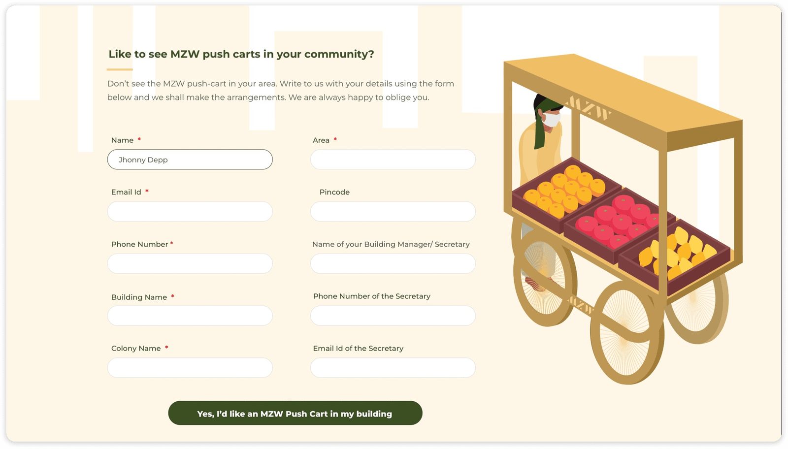
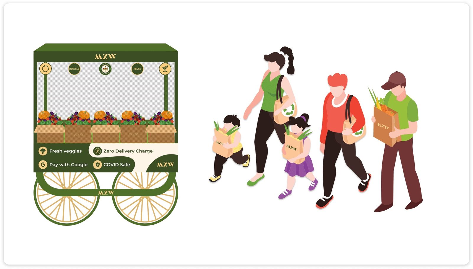
- Stylised illustrations: Custom illustrations became a signature visual language, solving photography gaps elegantly
- Labelled icons: "Refill Pouch" and "Compostable Container" labels added below all action icons, so their meaning is clear
- Autocomplete search: Implemented intelligent search with category suggestions and product thumbnails
07From the work
08Takeaways
- Zero-waste shopping needs to be as usable as conventional e-commerce to succeed at scale
- Small visual cues, like labelled icons, can have outsized behavioural impact on conversion
- Success stories and social proof build community, not just credibility
About outcomes This page shows the work, not results. Outcome figures from this engagement are not published here because we hold no dated source for them; our client case studies show measured outcomes with their limits.