
Design engagement · Brand identity
ConslTek
A brand identity for a US managed security provider in healthcare, built to signal trust and professionalism in a regulated market and to stand apart from generic tech providers.
- Client
- ConslTek
- Sector
- Healthcare IT security
- Market
- US (California)
- Work
- Brand identity
01The brief
ConslTek is a managed security services provider specialising in healthcare. They needed a new visual identity that would convey trust, professionalism, and innovation while differentiating them from generic tech providers in a highly regulated industry.
02Discovery
Research revealed a clear need for a modern, clean design that emphasised security and reliability without losing the human touch. Healthcare IT clients demand trust signals. The brand needed to feel both technically capable and approachable to non-technical stakeholders.
03Goals
- Design a logo that symbolises security, efficiency, and innovation in healthcare IT
- Develop a colour palette that communicates trust, professionalism, and warmth
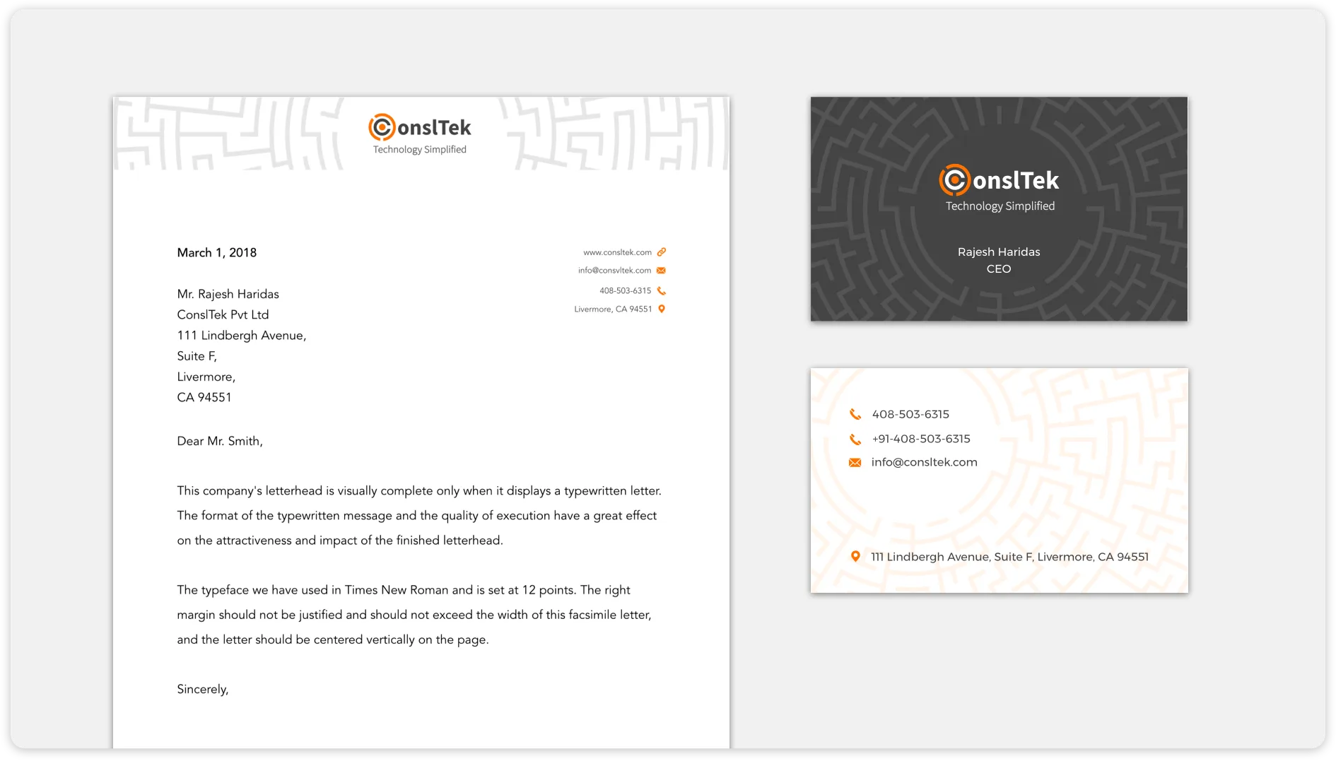
- Create consistent brand stationery across all key touchpoints
04Design decisions
- A maze motif symbolising the complexity of IT security, navigated with expertise
- A "C" embedded within the maze representing customer-centricity at the core
- A modern sans-serif typeface for clarity and authority across all materials
05Type and colour
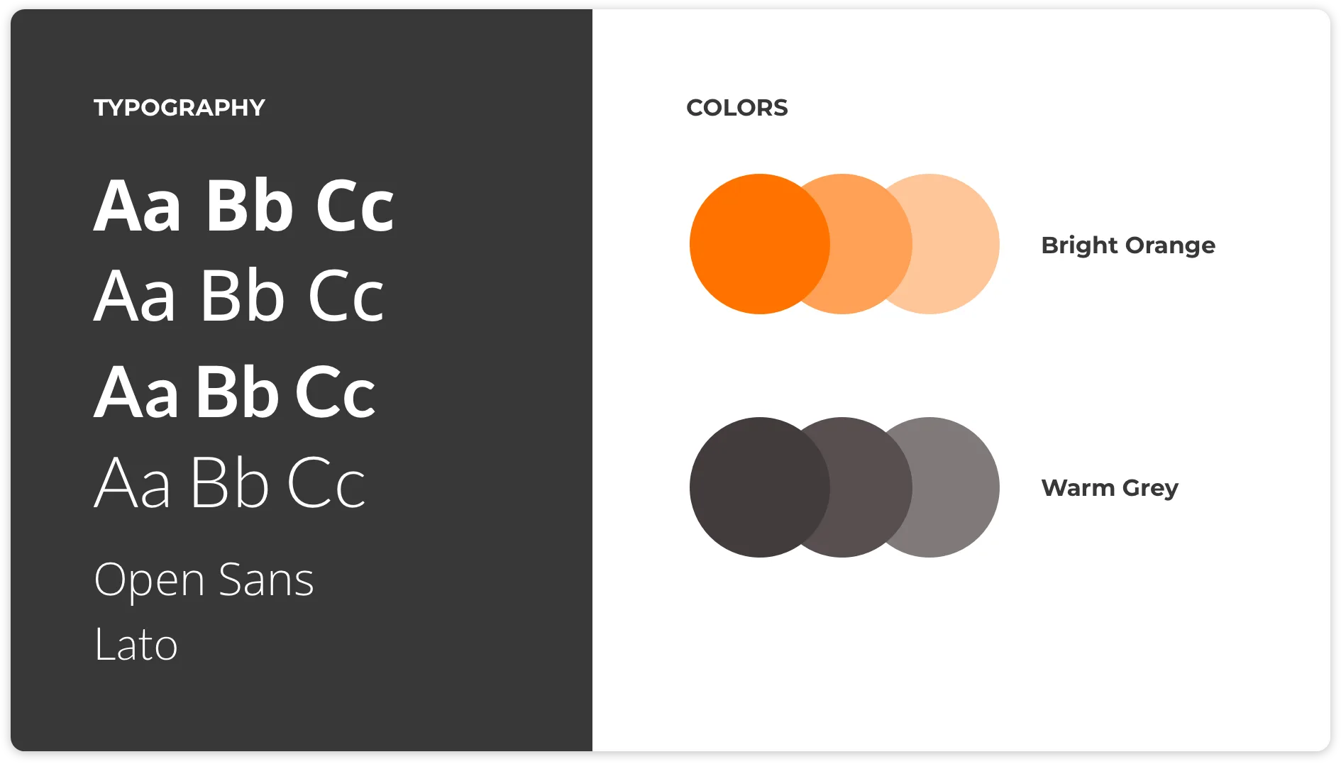
Primary: Open Sans: clean, authoritative, highly readable across digital and print.
Secondary: Lato, a complementary typeface adding warmth to supporting content.
- Orange #E87722
- Grey #4A4A4A
- White #FFFFFF
06Problems and solutions
What was in the way
- Brand values in healthcare IT: The logo needed to communicate core values in a highly specialised, trust-sensitive sector
- Technical vs. human balance: Conveying deep technical expertise while remaining approachable to non-technical decision-makers
- Consistent brand touchpoints: Ensuring coherent brand expression across digital and physical materials
What we changed
- Maze + "C" logo: A distinctive mark that visually represents the complexity ConslTek navigates on behalf of clients
- Balanced palette: Warm orange for energy and authority, mid grey for professionalism, and white for clarity. The palette reads as confident and approachable
- Full stationery suite: Business cards, letterheads, and envelopes maintaining strict brand consistency
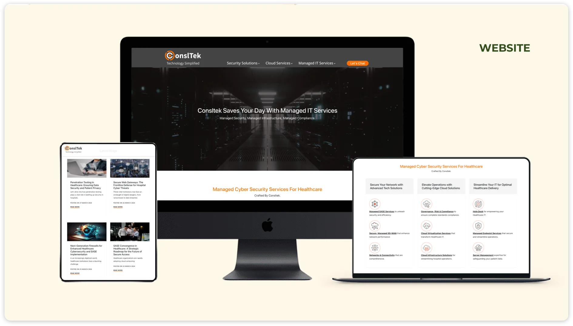
07From the work
08Takeaways
- A well-designed logo can powerfully symbolise a company's core values and differentiators
- Balancing professionalism and approachability is key in B2B healthcare brand identity
- Consistent branding across all touchpoints reinforces credibility and trust
About outcomes This page shows the work, not results. Outcome figures from this engagement are not published here because we hold no dated source for them; our client case studies show measured outcomes with their limits.