
Design engagement · Brand identity
OG Farms
A brand identity for a hydroponic farm-to-fork start-up: logo, palette, type, website and social presence positioning the produce as modern, sustainable and quality-obsessed.
- Client
- OG Farms
- Sector
- Hydroponic farm-to-fork produce
- Work
- Brand identity
01The brief
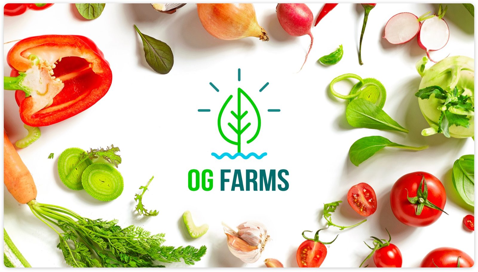
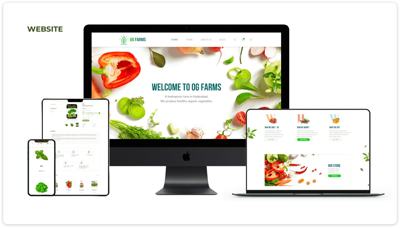
OG Farms is a hydroponic startup delivering premium, locally grown produce directly to consumers and restaurants. Goals: create a compelling logo, website, and social presence that positioned the brand as modern, sustainable, and obsessively quality-driven.
02Discovery
Target audiences included eco-conscious foodies, professional chefs, and tech-savvy urban consumers. Research confirmed that subscription delivery models performed best in this category, and that the most common barrier to purchase was scepticism about flavour versus traditional soil-grown produce.
03Goals
Brand Personality: Innovative, radically transparent, and superior in flavour, not just in process.
Design Direction: A clean aesthetic with subtle technological references, hinting at precision farming without feeling cold or clinical.
04Design decisions
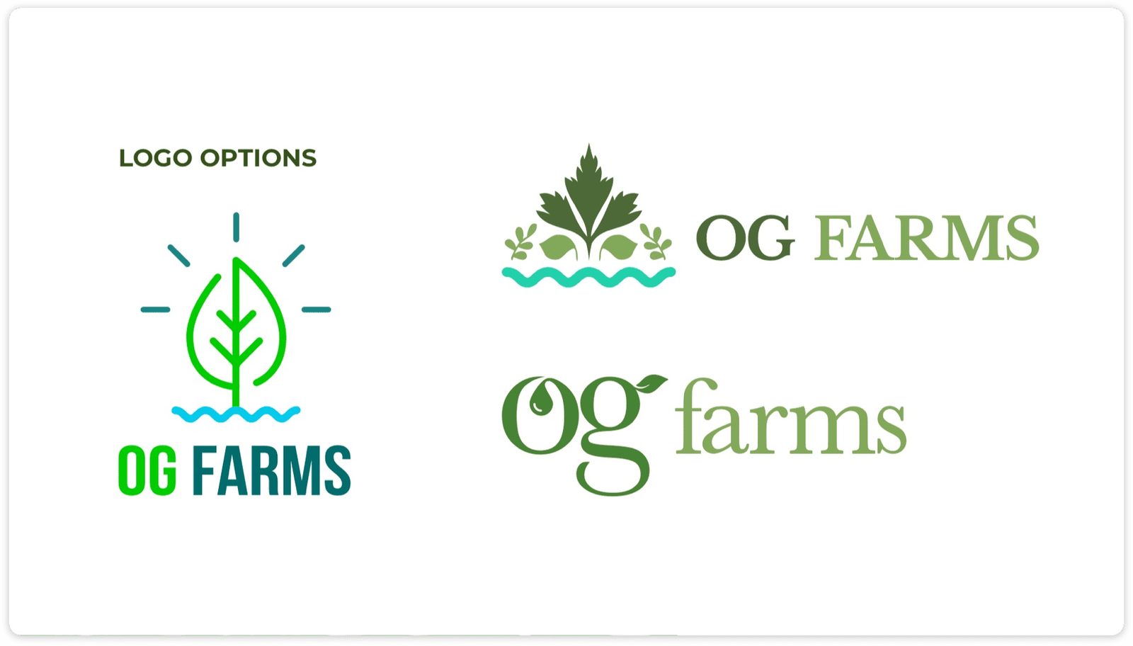
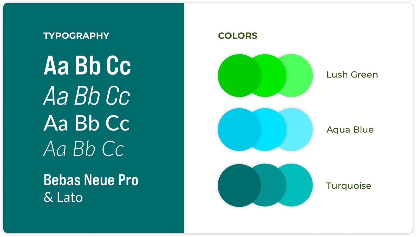
- Logo: a leaf-meets-water mark symbolising the hydroponics process and natural abundance
- Website: seamless ordering flow, farm storytelling, and recipe integration
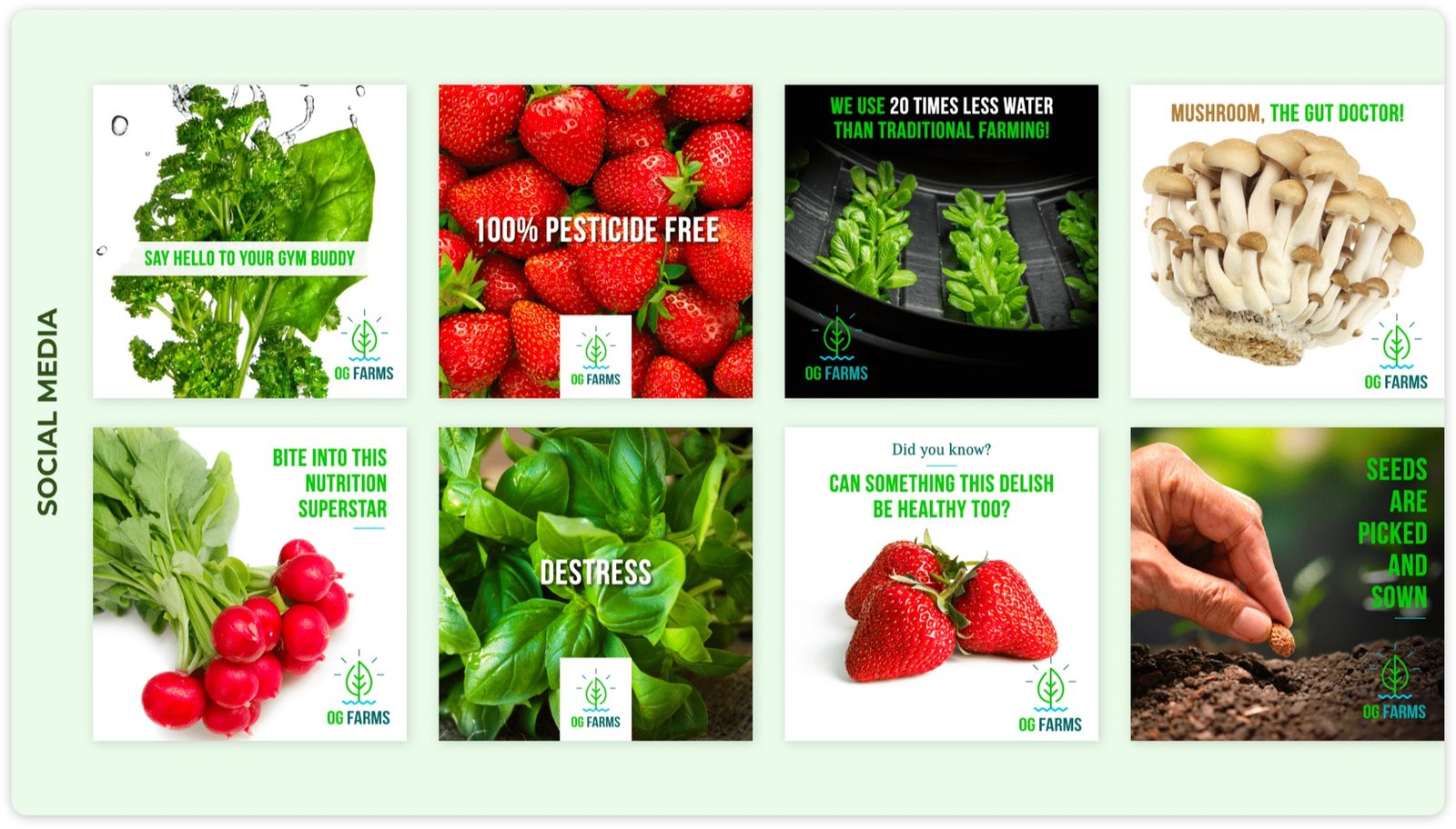
- Social: behind-the-scenes farm content and user-generated cooking moments
05Type and colour
Primary: Bebas Neue Pro: condensed, confident headlines that read well on packaging and social posts.
Secondary: Lato: warm and legible for product information and navigation.
- Lush Green #2D7A4F
- Aqua Blue #00B4D8
- Turquoise #40E0D0
06Problems and solutions
What was in the way
- The "sci-fi" stigma: Hydroponic growing was associated with sterile, laboratory aesthetics, the opposite of what food brands want to project
- Overly local messaging: Initial brand positioning was too geographically narrow to attract wholesale and chef partnerships
What we changed
- Wood textures and produce photography: Warm, organic visual language shifted perception from lab to farm, keeping focus on flavour and freshness
- Global food security narrative: Repositioned hydroponics as a solution to global food challenges, attracting B2B partnerships and press coverage
07From the work
08Takeaways
- Hydroponics connects most powerfully when the story centres on the joy of eating, not the science of growing
- Sustainable technology is most compelling when the product is demonstrably superior. Let quality lead
- B2B and B2C audiences need different messaging: tailor each journey without creating two separate brands
About outcomes This page shows the work, not results. Outcome figures from this engagement are not published here because we hold no dated source for them; our client case studies show measured outcomes with their limits.