
Design engagement · Brand identity
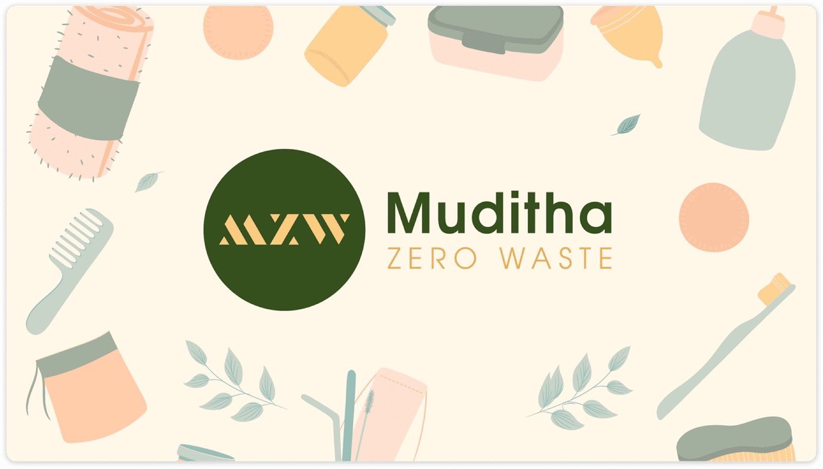
Muditha Zero Waste
A brand identity for a zero-waste online supermarket in India: approachable and empowering rather than preachy, with an illustration system, palette and type that carry across web and packaging.
- Client
- Muditha Zero Waste
- Sector
- Zero-waste online grocery
- Market
- India (Hyderabad)
- Work
- Brand identity
01The brief
Muditha Zero Waste needed a brand identity that would increase brand recognition, convey trustworthiness, align with their sustainable ethos, and attract an eco-conscious audience. The brand had to feel approachable and empowering, not preachy.
02Discovery
Competitor analysis revealed two dominant styles in the zero-waste space: overly "crunchy" aesthetics and sterile minimalism. There was a clear gap for an approachable, design-forward brand. Target customers prioritised sustainability, convenience, and trust, in that order.
03Goals
Brand Personality: Knowledgeable guide, practical, and relentlessly positive.
Target Audience: Urban dwellers aged 25–45 who want to reduce their footprint without sacrificing convenience.
04Design decisions
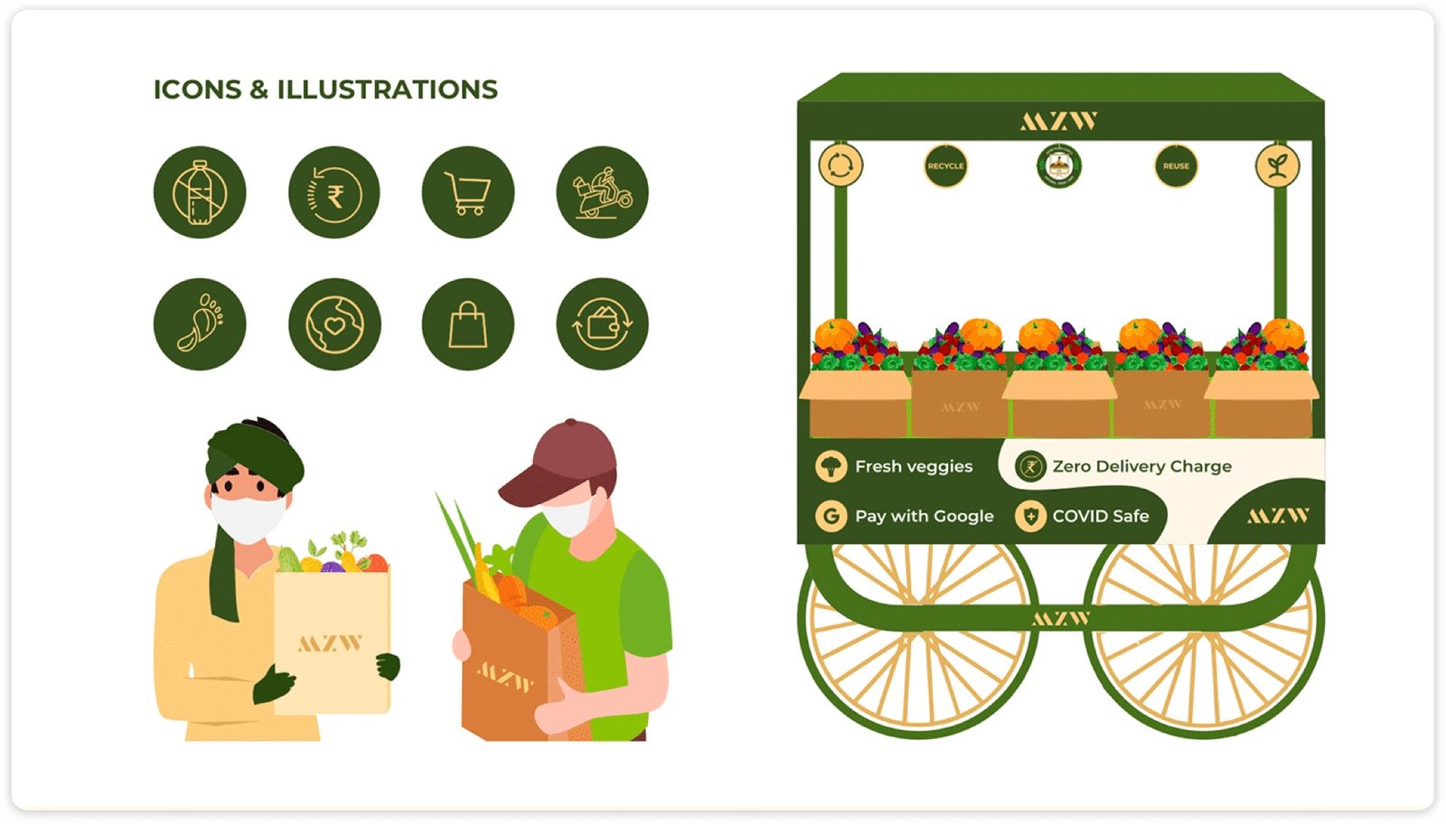
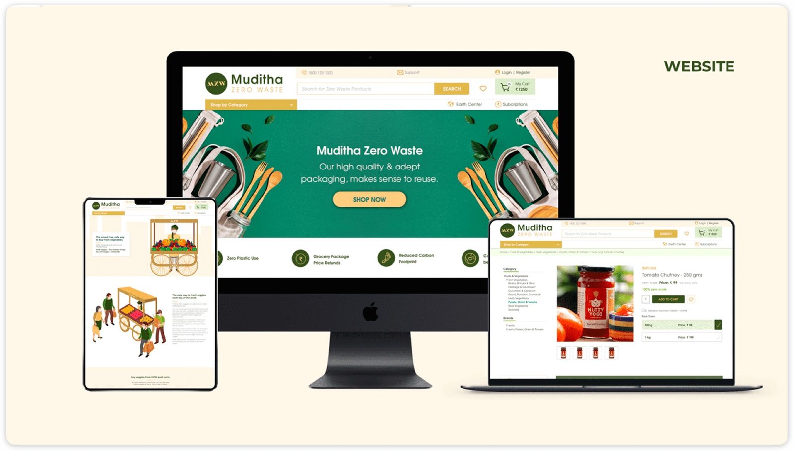
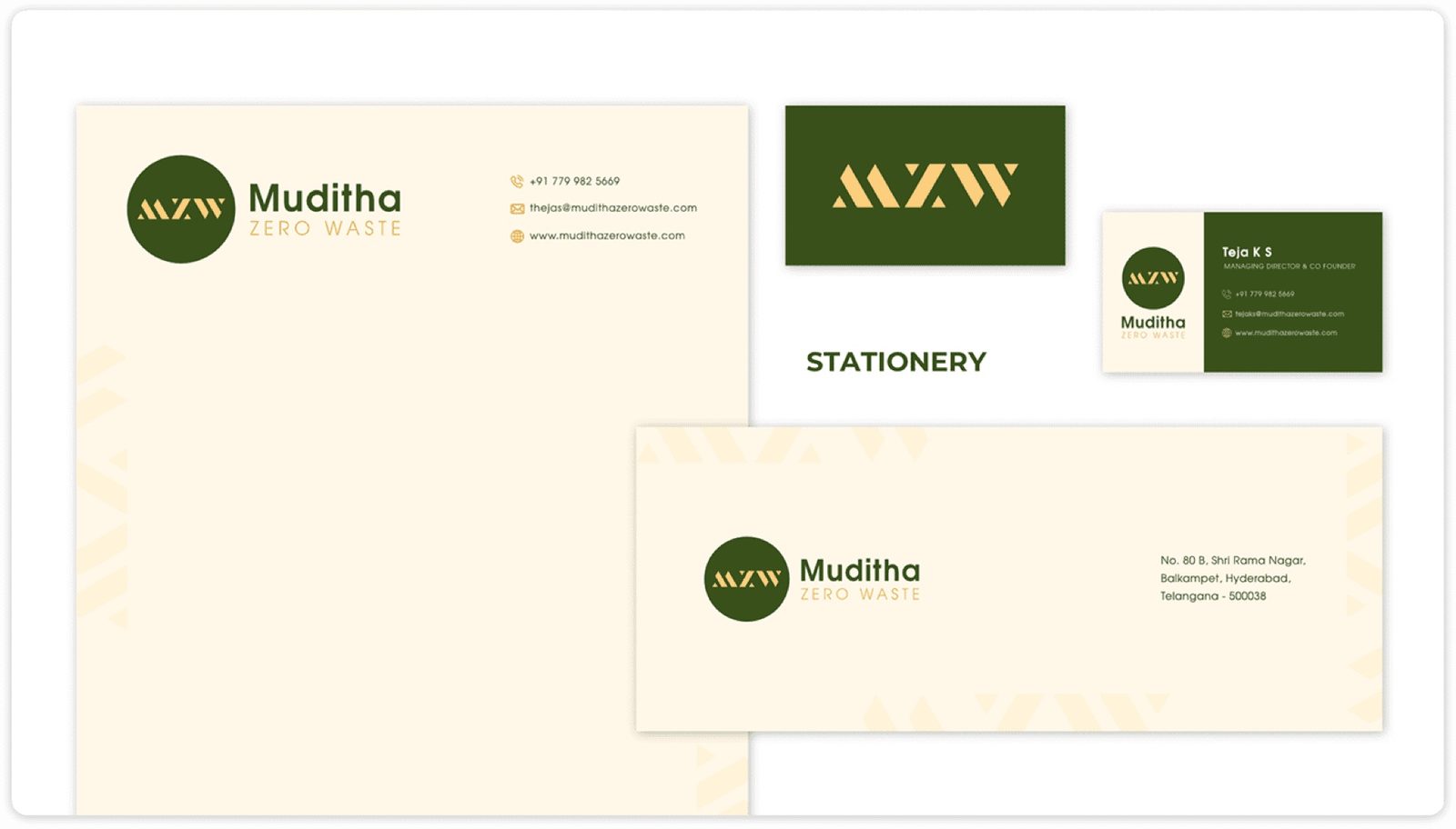
A minimal typographic logo with a circle motif representing the circular economy. The website used generous negative space, clear product categories, and subtle micro-animations. Soft hand-drawn illustrations gave the brand warmth and differentiation from clinical competitor aesthetics.
05Type and colour
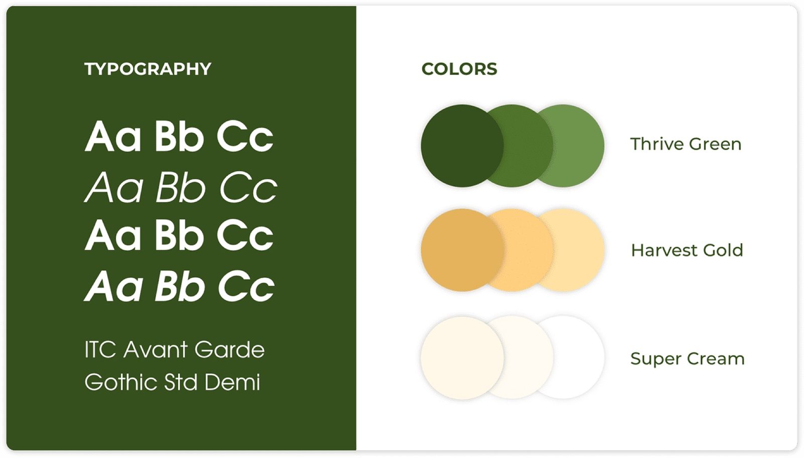
Primary: ITC Avant Garde: geometric, modern, and uniquely distinctive.
Secondary: Gothic Std Demi: structured and legible for body content and navigation.
- Thrive Green #4A7C59
- Harvest Gold #C8A951
- Super Cream #F5F0E8
06Problems and solutions
What was in the way
- Photography constraints: Eco-friendly products were difficult to photograph compellingly at launch
- Eco-friendly packaging: Glass-heavy inventory required sustainable packaging solutions that didn't compromise the unboxing experience
- Content bottleneck: Building a library of authentic content was slow, limiting early social proof
What we changed
- Stylised illustrations: Custom hand-drawn illustrations replaced photography, becoming a signature brand element
- Sustainable packaging: Recycled paper wrapping and reusable container returns programme
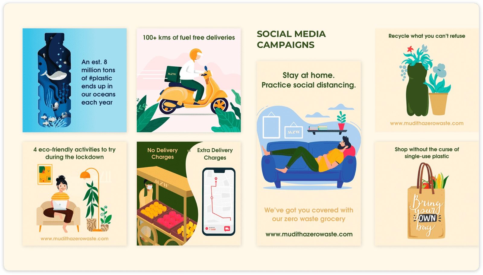
- #MudithaMoments UGC campaign: Turned customers into content creators, rapidly building authentic social proof
07From the work
08Takeaways
- Sustainability doesn't have to sacrifice usability. Good design makes both achievable
- Messaging that empowers rather than shames builds deeper brand loyalty
- Accessibility must be a priority from day one, not a retrofit
About outcomes This page shows the work, not results. Outcome figures from this engagement are not published here because we hold no dated source for them; our client case studies show measured outcomes with their limits.