
Design engagement · Website UX/UI
BASCC
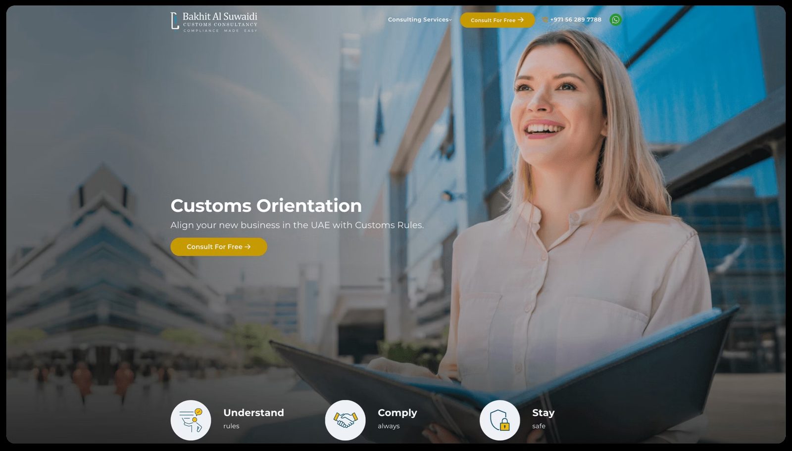
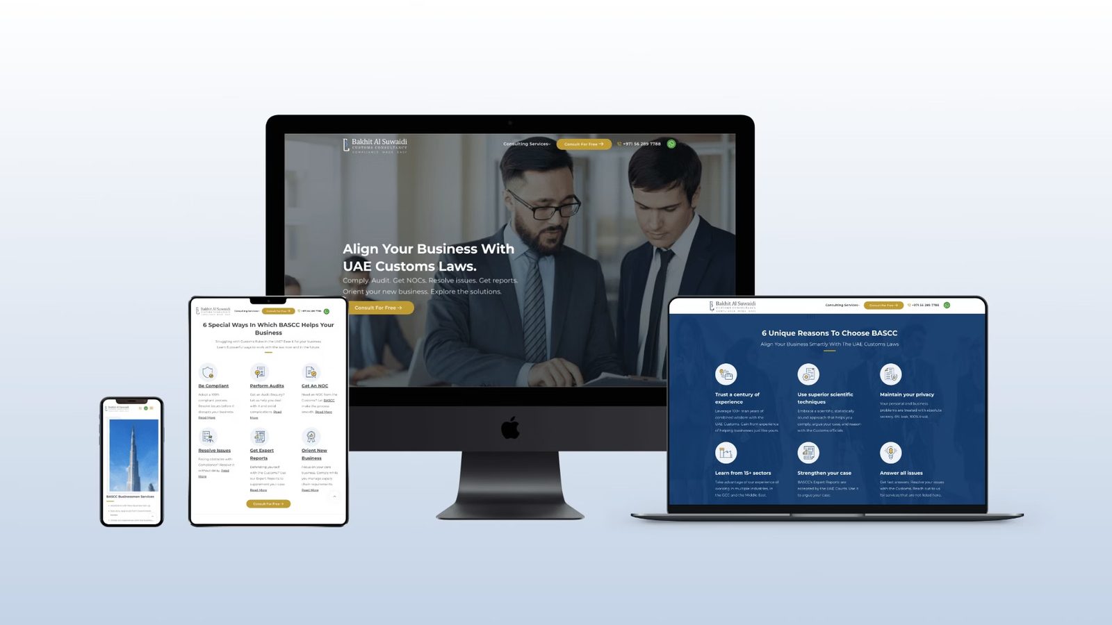
A website redesign for a customs law consultancy in the UAE: clearer navigation, a stronger visual hierarchy and calls to action that lead visitors to get in touch.
- Client
- BASCC
- Sector
- Customs law consultancy
- Market
- UAE
- Work
- Website UX/UI redesign
01The brief
BASCC needed a website redesign to better communicate their services and improve user engagement. The goal was to create a user-friendly UI/UX that clearly guides visitors through their offerings and encourages them to get in touch.
02Discovery
We conducted a thorough analysis of the existing website and identified key issues: unclear navigation structure, lack of visual hierarchy, and limited calls-to-action. Competitor research helped us understand best practices in the legal services industry.
03Goals
- Streamline navigation to make it easier for users to find information
- Create a clear visual hierarchy to guide users through the content
- Implement strong calls-to-action to drive user engagement
04Design decisions
- A prominent hero section with a clear call-to-action to encourage user engagement
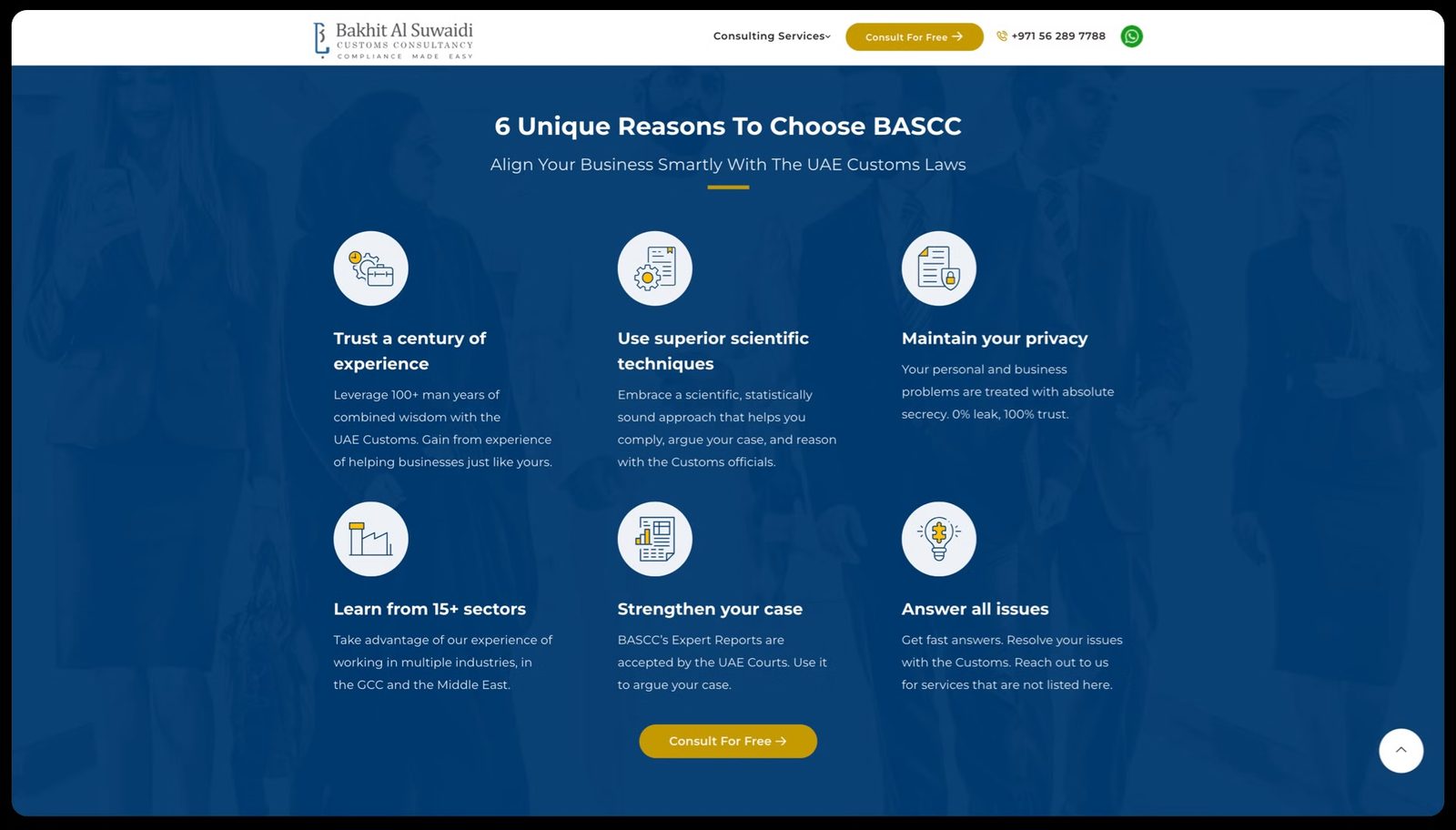
- Key services sections with icons and brief descriptions for quick understanding
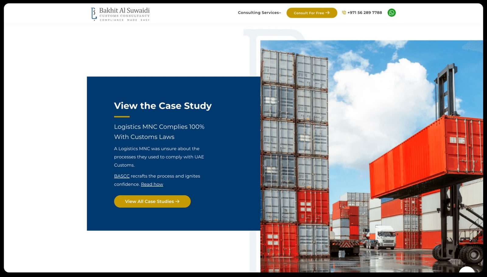
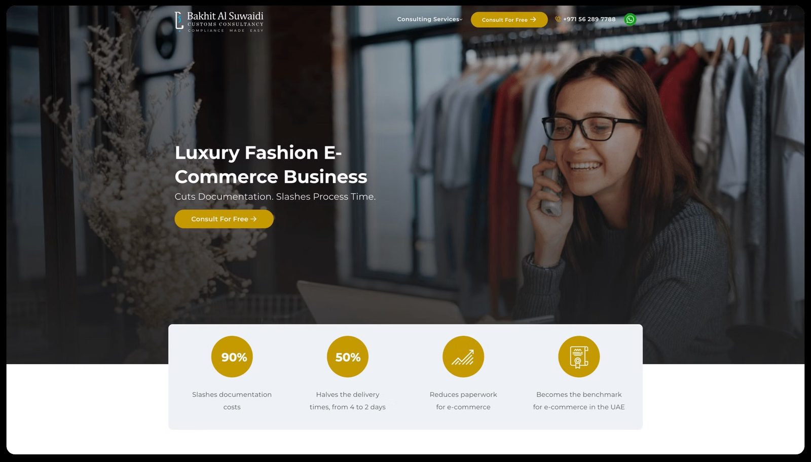
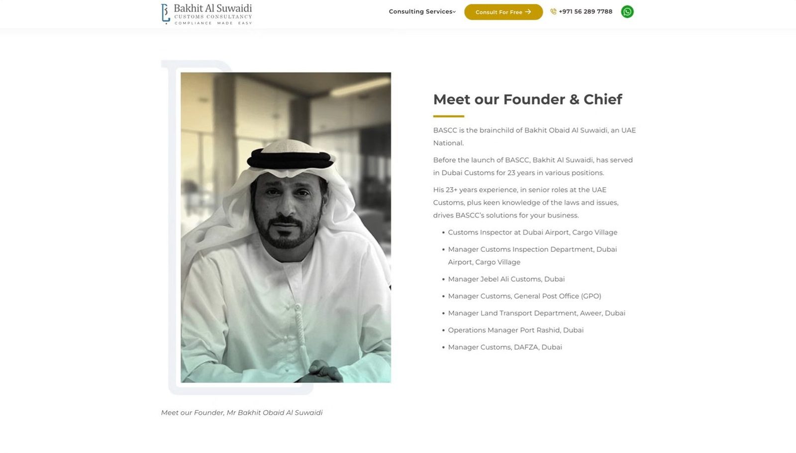
- Testimonials and case studies to build trust and credibility
05Type and colour
Primary Font: Montserrat, a clean, modern sans-serif typeface that conveys professionalism and is highly legible across all screen sizes.
- Royal Blue #1A3A6B
- Gold #C8A951
- White #FFFFFF
06Problems and solutions
What was in the way
- Unclear navigation: Users struggled to find the information they needed
- Lack of visual hierarchy: Content was not organised in a way that guided users effectively
- Limited CTAs: The website lacked clear calls-to-action to drive user engagement
What we changed
- Streamlined navigation: Implemented a clear, intuitive navigation with dropdowns for easy access
- Visual hierarchy: Used typography, colors, and whitespace to create a clear content hierarchy
- Prominent CTAs: Added compelling calls-to-action throughout the site to guide user actions
07From the work
08Takeaways
- Clear navigation is crucial for guiding users to the information they need
- Strong visual hierarchy helps users understand the content and take action
- Prominent CTAs are essential for driving conversions and lead generation
About outcomes This page shows the work, not results. Outcome figures from this engagement are not published here because we hold no dated source for them; our client case studies show measured outcomes with their limits.